Case Studies—Workday
Designing a Compelling Product Narrative for a Disruptor
Workday is a leading provider of enterprise cloud applications for human resources and finance. They deliver human capital management, financial management, and analytics applications designed for the world’s largest organizations.
Workday wanted to rethink the product narrative on it’s website. They wanted a better user experience through self-service, digitally delivered eCollateral, and a tigher integration with campaign marketing for lead tracking and additional marketing efforts. It had to be engaging and speak to the values, people and passion at the core of Workday’s way of running a business.
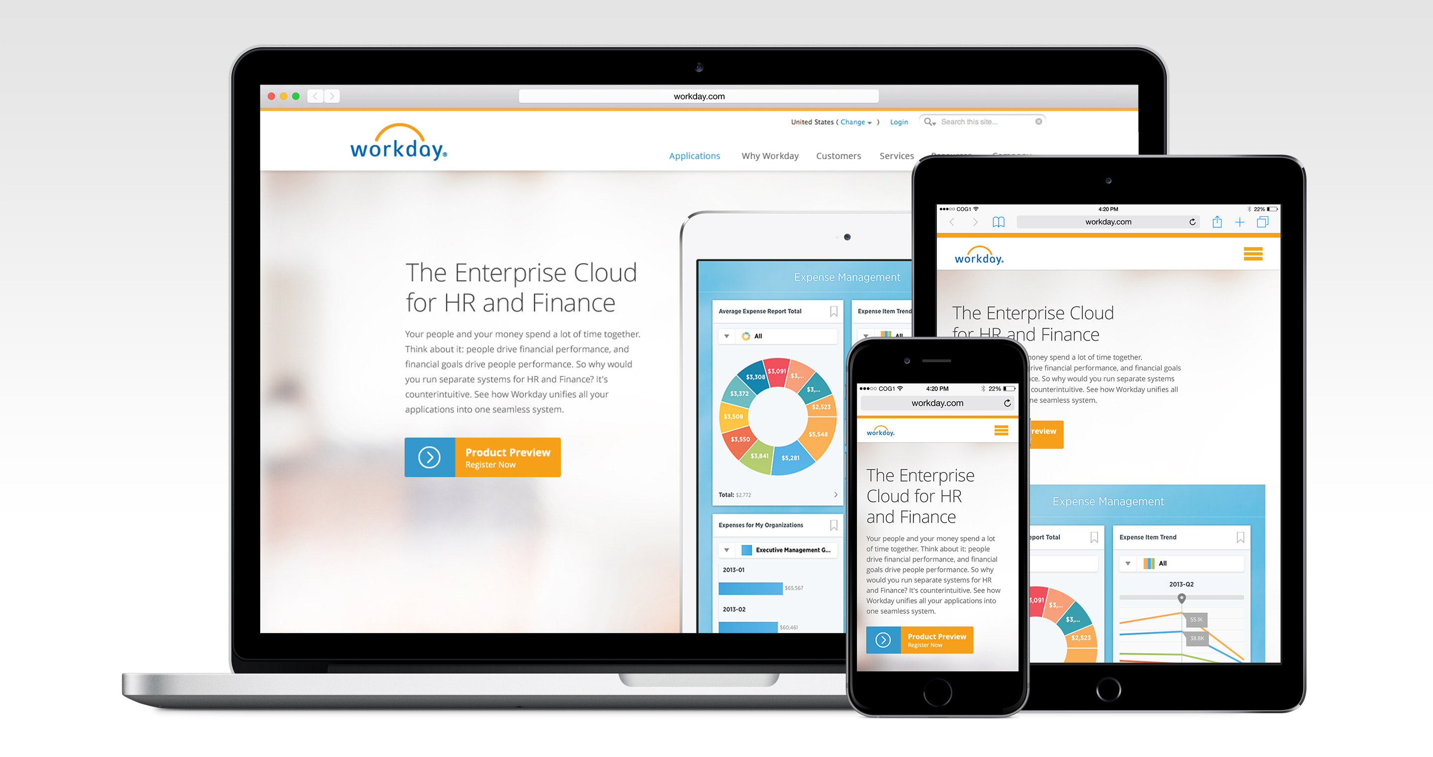
We redesigned a responsive, product driven narrative framework that showcases one of Workday’s pivotal differentiators – the visual design of its apps.
www.workday.com- Services Provided:
- Web Design & Development
Challenge:
- 01. Improving the company and product narrative
- 02. Unorganized information architecture
- 03. Users were viewing the website on multiple devices
- 04. Getting a design and content strategy that would benefit the user
Solution:
We aimed to up-level the overall event user experience by providing users with the ability to manually input, self-scan, or have their badge scanned by a booth employee, self-select Workday digital material (eCollateral), and receive their eCollateral selections by email.
In addition, this project allowed event marketing to have direct access to nurture and prospect campaign marketing initiatives through integration to our marketing automation platform preventing lengthy data research projects and manual list uploads.
We redesigned a responsive, product driven narrative framework that showcases one of Workday’s pivotal differentiators – the visual design of its apps.
01.
Design a New Narrative Based on a Great User Experience
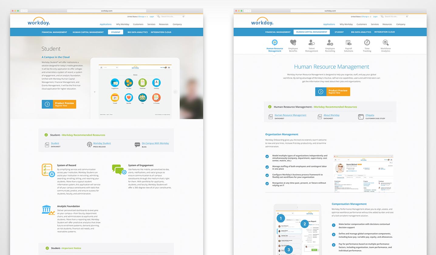
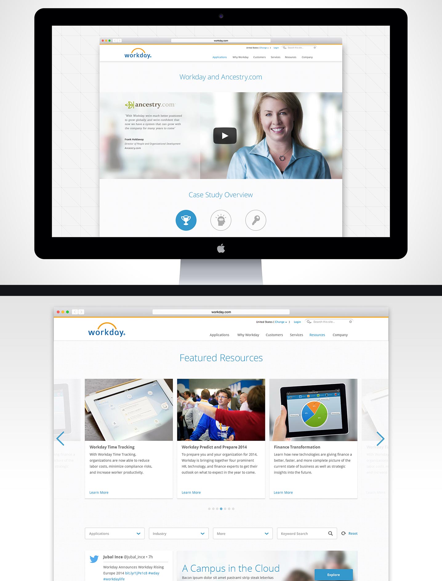
The website narrative was broken by including content that was not related, out of sequence, and ultimately frustrating to the two key actions we believed users would want to take upon reviewing a product; a) register for a product preview or b) explore contextual recommendations from happy customers. Both of these paths were a win for the business development team.
We redesigned the narrative to capture users information through a logical user experience, allow users an exit from that flow and into a new user flow where they could more deeply engage with the stories and case studies of happy Workday customers.
02.
Create a Content Strategy with a More Intuitive Flow
We began by updating the information architecture and sitemap. Cleaning up the navigation required that the existing content be effectively mapped and then regrouped and resequenced in order to provide a more intuitive flow throughout the current site.
Workday was telling the same story in multiple ways through the Applications, Why Workday, By Role and By Industry sections. We solved this by designing an effective corporate site that told people more, with less, faster. We reversed the flow to sell the suite as a suite in order to provide prospective clients with the necessary overview of the service, before breaking it down to its constituent parts.
03.
Mobile First Design Approach
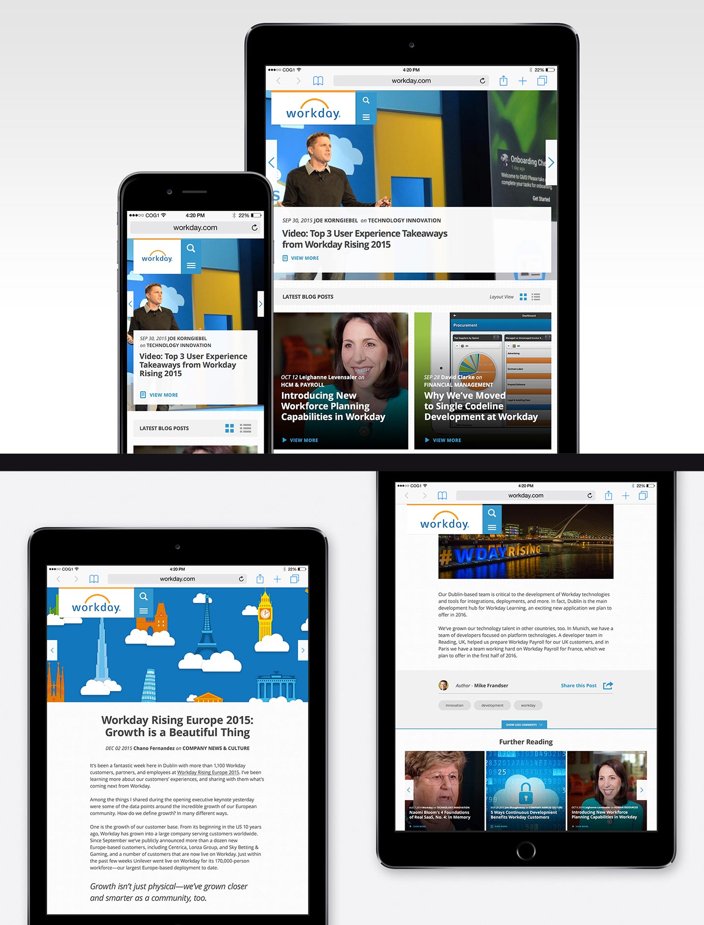
We designed all website content for mobile devices based on interactions users were likely to commit to. Consolidating the mobile first approach allowed to us positively transform how users engaged with Workday on handheld devices.
After testing, we found that the mobile use of the website felt native and unique to a mobile users expectations.
04.
Focused User Testing
We invited people to perform usability testing on all aspects of the website. Testing occured frequently as new flows were designed, so we could be sure that our designed experiences were meeting user objectives.
The testing provided valuable feedback that we used to modify design features, content, and key parts of the user experience to create a more fluid and intuitive experience for Workday visitors.
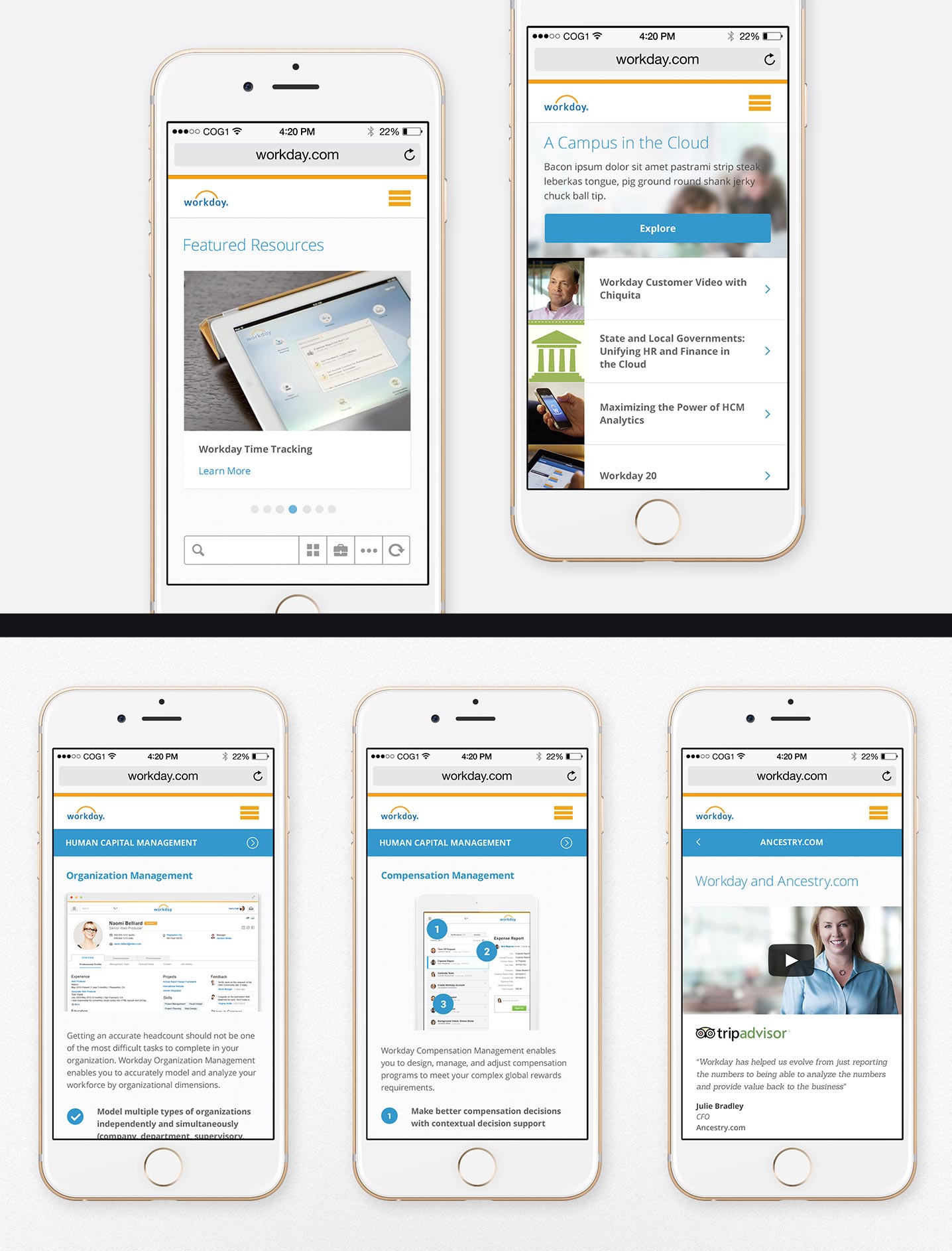
Results:
We were able to create an optimized version of the Workday website that truly honored the brand and was built to be future-friendly, scalable, and performed well at any screen size.
- UsabilityOptimized user experience to meet key objectives
- ResponsiveWebsite displayed on all devices and page speed increased
- ConversionCompliments conversion and included compelling offers
- TechnologyScalable for the future and integrated with usability